Frameless White Shaker Kitchen Renovation — Bellmont Cabinetry, Black Counters & Mixed Metals
Picket Tile Backsplash, Brass Faucet & Floating Oak Shelves
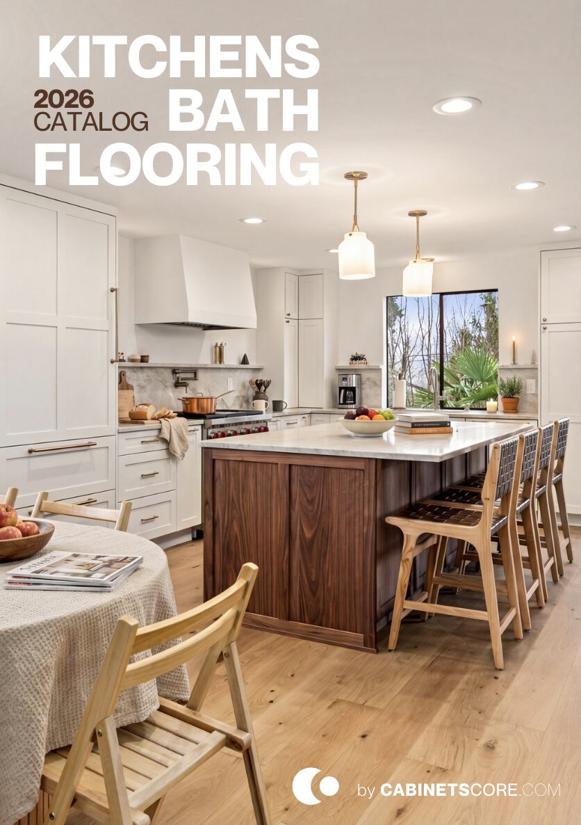
White shaker kitchens get dismissed as the safe choice — and most of them are. This one isn’t, and the difference is in three deliberate decisions: frameless cabinet construction instead of standard face-frame, black counters instead of white-on-white, and mixed-metal hardware that gives the room visual variation it would otherwise lack. Strip those three decisions out and you have an ordinary white kitchen. Put them in, and the room has actual character.
This was a renovation, not a structural remodel. What changed: the cabinetry, the counters, the backsplash, the hardware, and the open shelving wall.
Frameless Cabinetry — Why the Construction Type Matters
The cabinets in this kitchen are Bellmont Frameless. That’s a construction choice, not a style choice, and it makes a measurable difference even when the door style looks similar.
Standard cabinets have a face frame — a wood frame around the front of the cabinet box that the doors attach to. Frameless cabinets skip that frame; the doors mount directly to the cabinet box. The visible result is a tighter reveal between doors and drawers, slightly more usable interior storage, and a cleaner overall look. The practical result is that frameless cabinetry pairs better with contemporary door styles, runs cleaner in stretches of multiple cabinets side by side, and accommodates inset hardware and soft-close mechanisms without the visual clutter face frames introduce. For homeowners drawn to a modern aesthetic but who still want shaker doors, frameless is the right call.
Black Counters in a White Kitchen — When It Works
The instinct in a bright white kitchen is to keep the counters bright too — white quartz, light marble, neutral stone. This kitchen went the opposite direction with honed black counters, and it’s the single decision that makes the room feel designed rather than spec’d.
White-on-white kitchens read flat in photos and even flatter in person. There’s no anchor for the eye. The black counters create horizontal weight at counter level — they give the room a grounding line that the white cabinetry can stack against. The honed finish (matte, not polished) is what keeps the black from feeling heavy. Polished black stone reflects light and reads dramatic; honed black absorbs light and reads grounded. For a kitchen that needs to feel bright but not blank, honed black is one of the more reliable countertop calls.
The Picket Tile — Not Subway, On Purpose
The backsplash isn’t subway tile. It’s elongated picket — the spear-shaped tile that’s narrower at the top and bottom than the middle. The shape matters because subway tile is the default backsplash choice in white kitchens, and a default doesn’t add anything to the room.
Picket tile does two things subway can’t. The vertical orientation draws the eye up, which makes the wall feel taller and the room feel more open. And the irregular shape adds geometric interest without adding color — the tile is still white, but it’s not visually quiet. For a kitchen where the cabinets are simple and the counters are doing the dramatic work, the backsplash needs to add subtle pattern without competing. Picket is well-suited to that role; subway would have read as “we picked the easiest option.”
Mixed Metals — Brass and Black, Done with a Rule
The hardware in this kitchen mixes brass and matte black, and there’s a specific rule that keeps it from looking random: brass on the lowers, black on the uppers, brass on the faucet. Pendants and sconces use matte black metal with brass accents.
The rule matters. Random metal mixing reads as indecision. Disciplined mixing — where each metal has a job and a zone — reads as designed. Brass at counter level (lower cabinet pulls, faucet) feels warm and tactile because it’s the metal you actually touch. Black up high (upper pulls, pendants) keeps the visual weight where it belongs and prevents the brass from dominating. The brass sconces and the brass-accented pendants are the bridge between the two zones. Same logic applies to any two-metal kitchen: assign each finish a role before mixing them, and the room reads coherent instead of chaotic.