Seattle Kitchen Renovation — Mingo Oak Bases, Ivory White Uppers & a Waterfall Island
Two-Tone Shaker Cabinetry, Brass Faucet & Glass-Front Display Cabinets
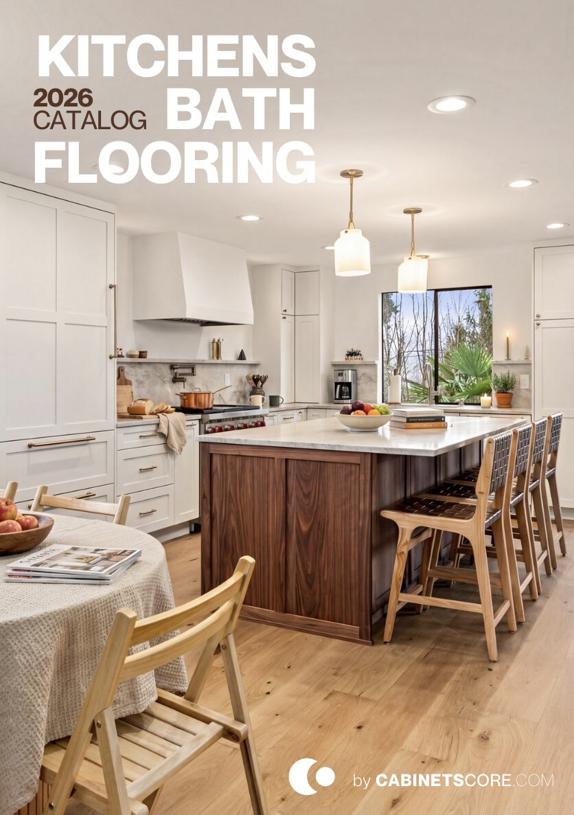
Two-tone kitchens that pair wood with white usually default to wood on the island and white on the perimeter. This project flipped that — natural oak on the perimeter bases, Ivory White on the uppers, with the island finished in oak to anchor the room. The result is a kitchen where the wood does the heavy lifting visually, and the white opens up the upper half of the room without taking it over.
This was a renovation, not a structural remodel. The footprint stayed the same. What changed: the cabinetry, the counters, the backsplash, the appliances, and the open shelving that replaced standard upper cabinetry in key spots.
Why Oak on the Bases
Most two-tone kitchens use wood as the accent — an oak or walnut island in an otherwise white kitchen. That’s the safe move, and it works, but it limits how much wood character the room can carry.
This kitchen put the wood where it does more work: on the perimeter bases, where you see it from every angle of the room, and on the island as well. White is reserved for the uppers, where it lifts the visual line and reflects the natural light coming in through the windows. The effect is a room that reads as a wood kitchen with white accents — not a white kitchen with wood accents. For homeowners drawn to the warmth of natural oak, this is the configuration that lets the wood actually set the room’s character. Reverse it (white bases, oak uppers) and the oak feels like a styling choice. This way, it feels like the foundation.
Stacked Uppers with Glass Cabinets — The Vertical Move
The upper cabinets in this kitchen run all the way to the ceiling in two tiers — standard uppers at working height, then a shorter row of glass-front cabinets above them.
The decision matters for two reasons. First, it eliminates the soffit gap that most kitchens have above the upper cabinets — that dust-collecting strip where decorative items go to die. Second, the glass cabinets give you display storage that doesn’t compete with the lower working cabinets. You put the everyday plates and glasses in the standard uppers, and the seasonal serving pieces, glassware, or anything visually nice in the glass cabinets above. It’s a way to add real storage without losing the open feel of a kitchen with restraint. The trade-off is honest: it costs more in cabinetry and trim, and you need a step stool to reach the top tier. For a kitchen meant to read as designed, both are worth it.
Brass Faucet, Black Pot Filler — A Specific Kind of Mixed Metal
Most mixed-metal kitchens stick to one combination — brass and black, or brass and chrome. This one uses brass throughout the hardware and lighting, with one black element: the pot filler above the cooktop. That’s not random.
The pot filler is the only piece of plumbing that’s wall-mounted, sitting against the backsplash. A brass pot filler in that location would have either visually disappeared into the cream-toned backsplash or pulled too much attention away from the cooktop. Matte black gives it a defined silhouette and frames the cooktop without competing with the brass faucet at the sink (which is on the other side of the kitchen, far enough away that the two metals don’t read as a conflict). The rule when adding a single off-color element: it should have a structural reason to be there, not just visual variety for its own sake.
Cream Tile Backsplash — Not White, On Purpose
The backsplash isn’t white. It’s a warm cream/ivory subway-style tile with subtle surface variation. That choice is worth understanding because in a kitchen with white upper cabinets, the default move would have been pure white tile.
Pure white tile against Ivory White cabinets would have created a flat zone — same color, same finish, no visual depth. The cream tile sits just warm enough to read as its own surface, picks up the oak tones from the cabinetry below, and gives the wall texture without adding pattern. The variation in tile color (each piece slightly different) is what keeps a single-color backsplash from looking institutional. This is the kind of decision that doesn’t show up on a materials list but determines whether a finished kitchen reads as warm or sterile.